13 Reports and charts
13 Reports and charts
Through Reports and Charts, you can examine the data in vtenext and extrapolate them from different points of view.
First of all, you have to identify the type of data extraction you want (i.e.: what do you want to obtain?) and, from there, build a report.
![13 [1].png](https://usermanual.vtenext.com/uploads/images/gallery/2022-06/rww13-1.png) Report Details
Report Details
![13 [2].png](https://usermanual.vtenext.com/uploads/images/gallery/2022-06/GMK13-2.png)
Summary Report
![13 [3].png](https://usermanual.vtenext.com/uploads/images/gallery/2022-06/BHP13-3.png)
Report Chart
13.1 Reports
Reports are organised in folders. You can create new ones and delete them (only empty folders can be deleted), and also switch to list view via the List button.
To create a new report, click on the button from the Reports module ![]()
 Once you click the button, a wizard opens up with an 10-step guided procedure that will allow you to make the report intuitively.
For example, you want to create a report on the Sales Orders module that only displays orders from IT companies. In this case the main data to be displayed are the orders, while the companies are involved only if they meet a condition (sector)
|
STEP 1 |
Report Details: |
|
STEP 2 |
Report Type: |
|
STEP 3 |
Time filter: |
|
STEP 4 |
Advanced Filters: |
|
STEP 5 |
Top-down clusters: |
|
STEP 6 |
Select Columns: |
|
STEP 7 |
Calculations: |
|
STEP 8 |
Sharing: |
|
STEP 9 |
Charts: |
|
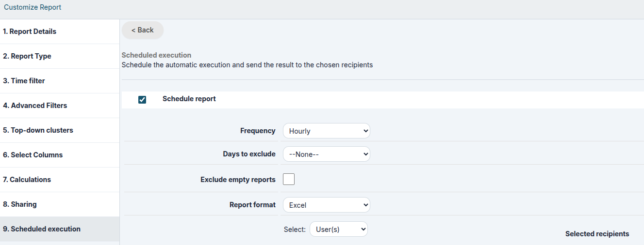
STEP 10 |
Scheduled execution (admin users only): Starting from version 26.04, two new options are available for scheduled reports:
These features help reduce unnecessary communications and make automated report distribution more efficient.
Warning: If you decide to use this function, the CRM will send a report displaying all the records it contains, without considering roles or profiles set in the CRM or the type of report sharing previously selected. |
At the end of the wizard, you will be able to view the report. Below are the functions available on the screen.
|
Summary Tab |
Visible only if the report is of the Summary type (step 2), it displays report information (counts and calculations divided according to grouping criteria) |
|
Report Tab |
Table with the results of the report |
|
Charts Tab |
Visible only if set in step 8, it shows the chart based on the report |
|
Time Interval |
Apply a time-based filter (temporary field, cannot be saved) |
|
Edit Button |
To edit the Report by repeating the previous steps |
|
Create Chart |
Generate a new chart relating to the report |
|
Duplicate |
Opens the wizard to save a new report, starting from the settings of the previous one |
|
Export in PDF |
Export the total report in PDF format |
|
Export in Excel |
Export the total report in Excel format |
|
|
Print the total report directly |
13.1.1 Basic Report Example
In this chapter, we will create a report using data from a single module, applying filters and aggregations to the displayed information.
The examples provided in this document are intended solely for illustrative purposes and are not necessarily representative of real-world scenarios. Each company and project has its own specific characteristics, data structures, and objectives, making it impossible to define practical examples that fit every operational need.
Therefore, this guide is not intended to prescribe which fields should be used or how reports should be structured for a particular business context. Its purpose is solely to explain the features of the Reports module and demonstrate the main ways in which the tool can be used.
Prerequisites
Before creating a report, it is essential to have a good understanding of the available data structure. Otherwise, you risk designing a report without knowing whether a specific piece of information is actually stored in the CRM. It is also very important to know the exact field names and the modules in which the information is stored, as these elements are crucial when defining filters, aggregations, and data processing logic.
For example, it is important to know whether a filter is applied to a free-text field or a picklist field, since the methods used to search, group, and aggregate data may differ significantly.
A solid understanding of the data structure enables you to design more accurate reports and helps avoid subsequent revisions caused by missing information or incorrect interpretations of the available
Report Requirements
The example report will be based on the Accounts module. Its purpose is to analyze the companies created during the current year, limiting the results to companies located in Italy and Poland, and belonging to the Engineering and Healthcare sectors.
This report is useful for the Sales department to monitor business performance in these two countries and within these specific industries.
The data will be aggregated using the following fields:
- Assigned To (the user responsible for the account record)
- Country (the country where the account is located)
Type (to analyze the types of companies created)
Let's get Started!
Report Creation
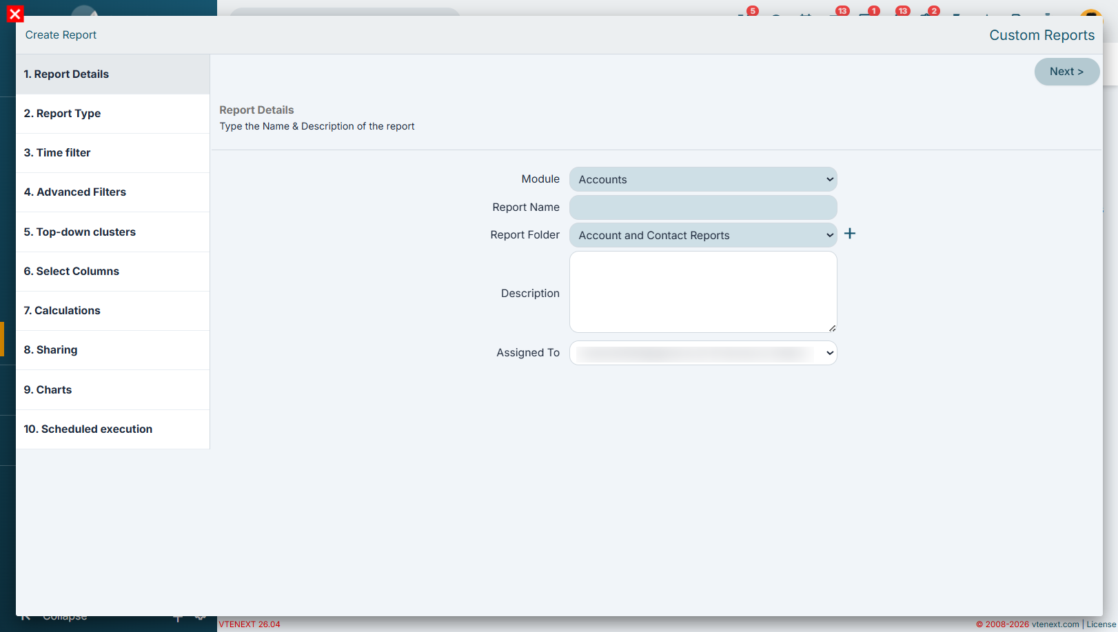
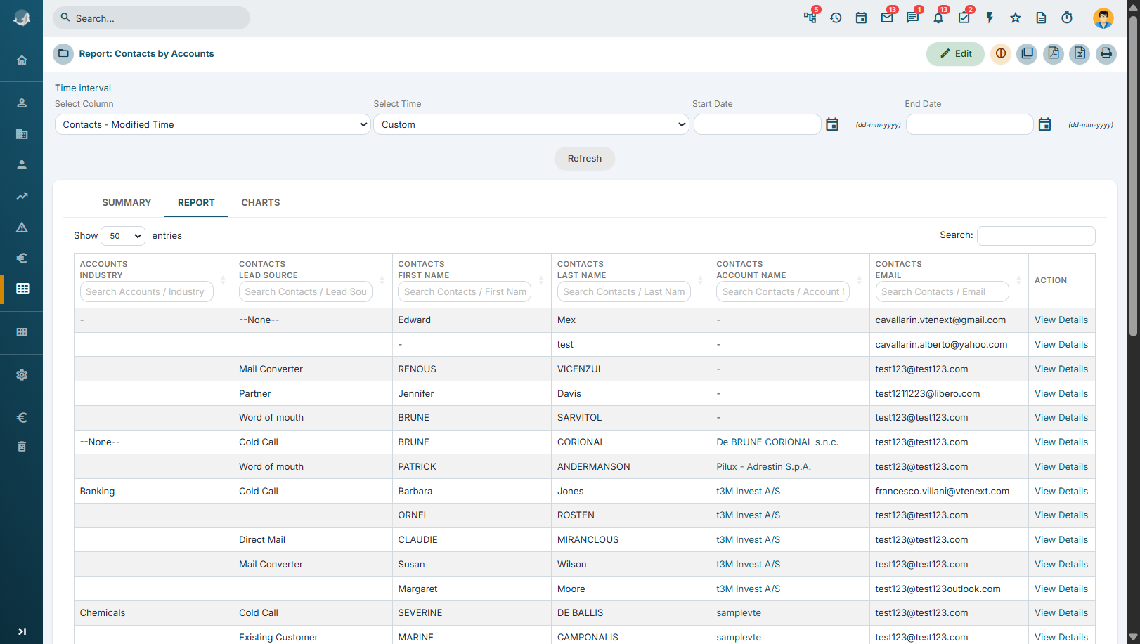
Step 1 - Report Details
Create the report by entering a name that clearly and concisely describes its purpose or content.
Next, select the folder where you want to save the report in order to maintain proper organization of the reports available in the system.
In the Description field, it is recommended to provide a brief explanation of the logic used in the report, including information such as:
- the filters applied;
- the aggregations used;
- any specific conditions or calculation criteria.
Documenting this information makes the report easier to understand over time and allows other users to quickly grasp its purpose, logic, and functionality.
Step 2 - Report Type
This topic will be covered in greater detail in Step 6 - Select Columns and later during the report analysis phase.
The goal is to better understand the differences between the two main report types:
- Tabular Report, which displays the details of individual records;
- Summary Report, which aggregates data based on the selected fields and provides summaries, counts, and statistics (available in the Summary tab).
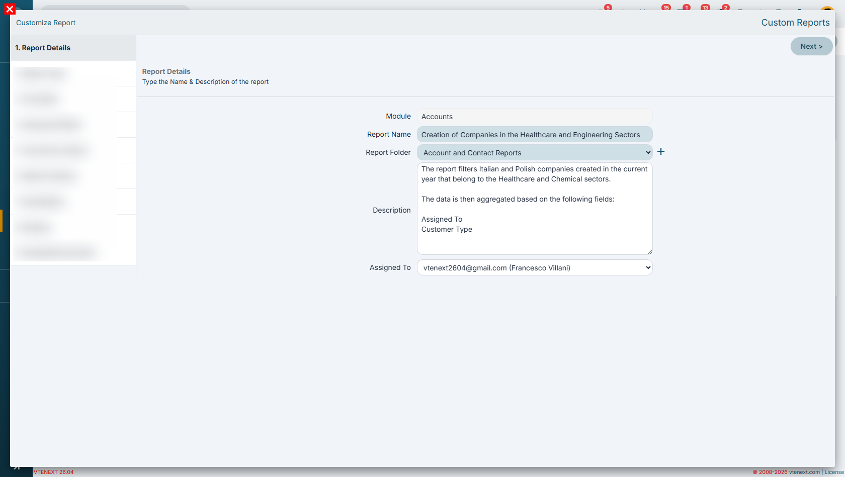
Step 3 - Date Filter
In this step, we configure the first filter condition based on a date field.
In our example, we select the Creation Date field and set its value to the dynamic filter Current Fiscal Year.
Using dynamic values is particularly important because it allows the report to update automatically over time.
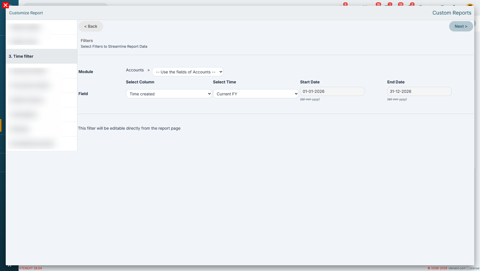
Step 4 - Advanced Filters
Next, we will filter the data by creating two separate groups of conditions:
-
Italian companies belonging to the Healthcare sector;
-
Polish companies belonging to the Engineering sector.
To achieve this, create two distinct filter groups:
Group 1
-
Country = Italy
-
Industry = Healthcare
Group 2
-
Country = Poland
-
Industry = Engineering
The two groups must then be connected using the OR logical operator, since we want to include companies that meet either of the two conditions.
In other words, the report will display:
-
all Italian companies in the Healthcare sector;
-
all Polish companies in the Engineering sector.
Using condition groups makes it possible to create more advanced filters and correctly combine different criteria within the same report.
It is important to carefully choose the logical operator and filter condition based on the type of field being queried.
For text fields, where the same value may be entered in slightly different ways, it is generally recommended to use the Contains operator. This approach makes the filter more flexible and increases the likelihood of capturing all relevant records.
In contrast, for picklist fields, it is recommended to use the Equals operator, since the available values are predefined and stored consistently. In this case, using Equals provides more accurate and efficient results.
Choosing the appropriate filter operator is essential to obtain reliable results and avoid unintentionally excluding relevant data or including records that do not match the intended criteria.
Step 5 - Top-Down Segmentation
For this report, it is not necessary to create any clusters, so this step can be skipped.
The cluster functionality will be explored in greater detail in the Advanced Reports section, where it becomes particularly useful for segmenting and classifying data according to more complex criteria.
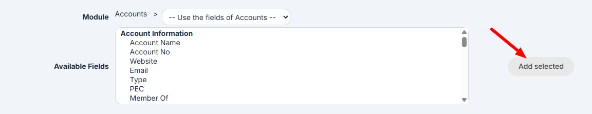
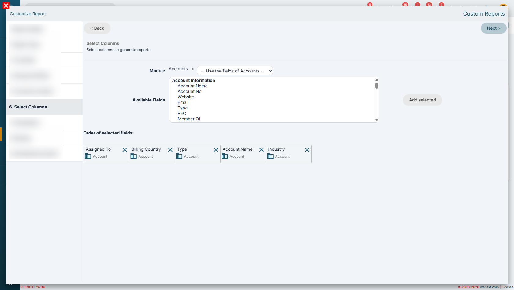
Step 6 - Select Columns
In this step, we select the columns that we want to display in the report.
For this example, all columns will be selected from the Accounts module using the drop-down menu available in Step 6.
Once you have selected the desired fields, it is important to click the Add Selected button to include them in the list of report columns displayed in the lower section of the page.
The selected columns will determine which information is available for display, grouping, sorting, and aggregation within the report.
It is at this stage that one of the main differences between a Summary Report and a Tabular Report becomes apparent.
With a Summary Report, you can:
-
aggregate data based on the selected fields;
-
decide whether to include fields in the Summary tab;
-
generate counts, totals, and grouped data views.
With a Tabular Report, these capabilities are not available.
A tabular report simply displays a list of records that match the defined criteria, without performing any data aggregation. In practice, the result is very similar to an export of filtered data, where each record is displayed individually.
For this reason, when the goal is to analyze trends, counts, or grouped information, a Summary Report is generally the preferred option. Conversely, when you need to view the complete details of individual records, a Tabular Report is the more appropriate choice.
Example of column selection in Step 6 for a Tabular Report (no column aggregation available)
Example of column selection for a Summary Report (with the ability to group data by a column and include it in the Summary tab)
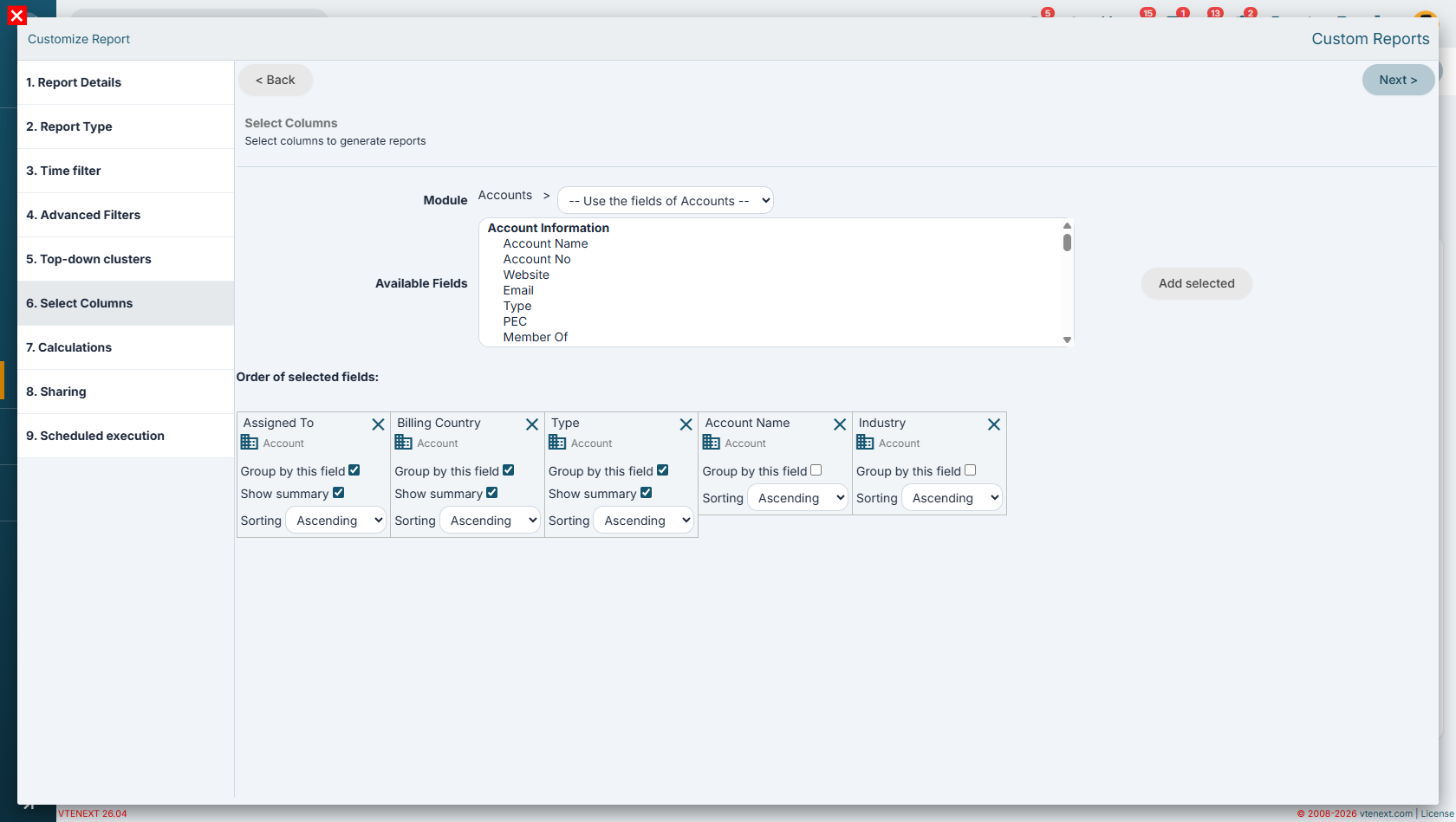
In this example, we aggregate the data by Assigned To in order to determine how many companies are managed by each user.
Next, we add a second level of aggregation based on the Country field to understand the geographical distribution of the companies assigned to each user.
Finally, we introduce a third level of aggregation using the Type field, providing an additional classification of companies within each country.
The result is a hierarchical structure that allows us to analyze:
-
how many companies are assigned to each user;
-
how those companies are distributed across different countries;
-
which customer types make up each group.
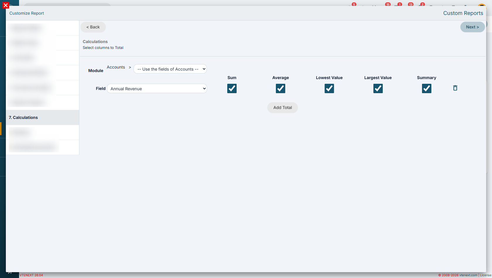
Step 7 - Calculations
To gain a more comprehensive overview of the records included in the report, we can add the Revenue field and configure one or more aggregation metrics.
In this example, we will select the following metrics:
-
Sum, to calculate the total revenue generated by the selected companies;
-
Average, to determine the average revenue of the records included in the report;
-
Minimum Value, to identify the company with the lowest revenue;
-
Maximum Value, to identify the company with the highest revenue.
The final available option, the Summary flag, can only be used in Summary Reports. In a Tabular Report, this functionality is not available because this report type does not generate a Summary tab.
It is also important to note that the Summary tab can display only one metric at a time. Therefore, it is not possible to select multiple metrics and display them simultaneously within the Summary tab.
When multiple metrics are configured, you will need to switch between them individually to analyze each calculation.
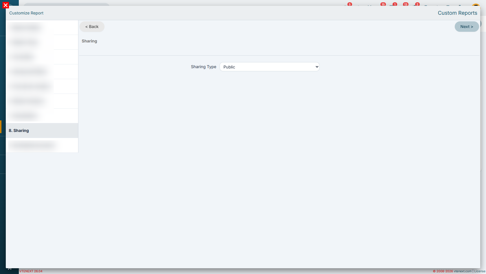
Step 8 - Sharing
In this example, we want the report to be visible to all users who have access to the reporting functionality. For this reason, we select the Public sharing option.
A public report can be viewed by all users who are authorized to access reports, without the need to assign specific permissions to individual users or groups.
If it is necessary to restrict the visibility of the report to specific users, groups, or roles, you can instead use one of the other sharing options provided by the system.
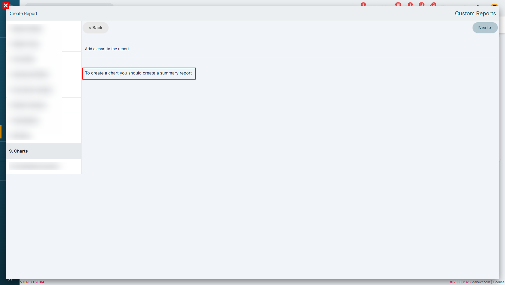
Step 9 - Charts
This step is available only for Summary Reports.
To create a chart, the report must generate a Summary tab. If this tab is not available, the system will not have any aggregated data to display graphically.
As a result:
-
Summary Report → allows charts to be generated from the aggregated data available in the Summary tab;
-
Tabular Report → does not generate a Summary tab and therefore does not provide any charting capabilities.
A tabular report is designed exclusively to display or export detailed record information without performing any grouping or data aggregation. For this reason, it cannot generate graphical representations of the data.
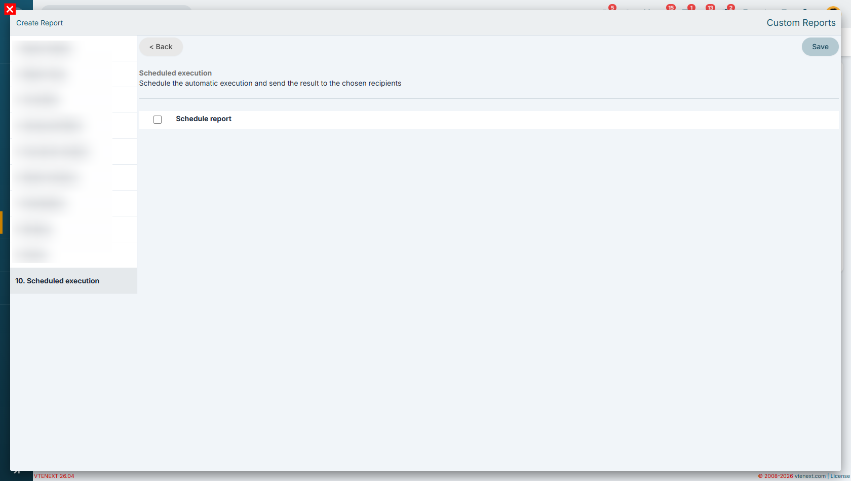
Step 10 - Scheduled Execution
In this example, we will not use the report scheduling feature.
Therefore, we can skip the configuration that allows the report to be automatically delivered in Excel, PDF, or both formats to one or more recipients.
Report Results (Tabular View)
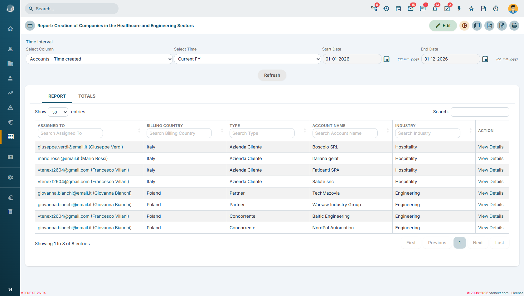
In the Tabular Format, data is displayed following the order of the columns selected in Step 6 - Select Columns of the report configuration wizard.
Unlike the summary view, this mode does not apply any grouping and does not calculate statistics or summaries. Records are simply displayed one after another, showing the detailed values requested.
For this reason, the Summary tab is not available in the tabular view, as no aggregations, counts, sums, averages, or other calculations are performed on the displayed data.
Report Results (Summary Report) - Report tab
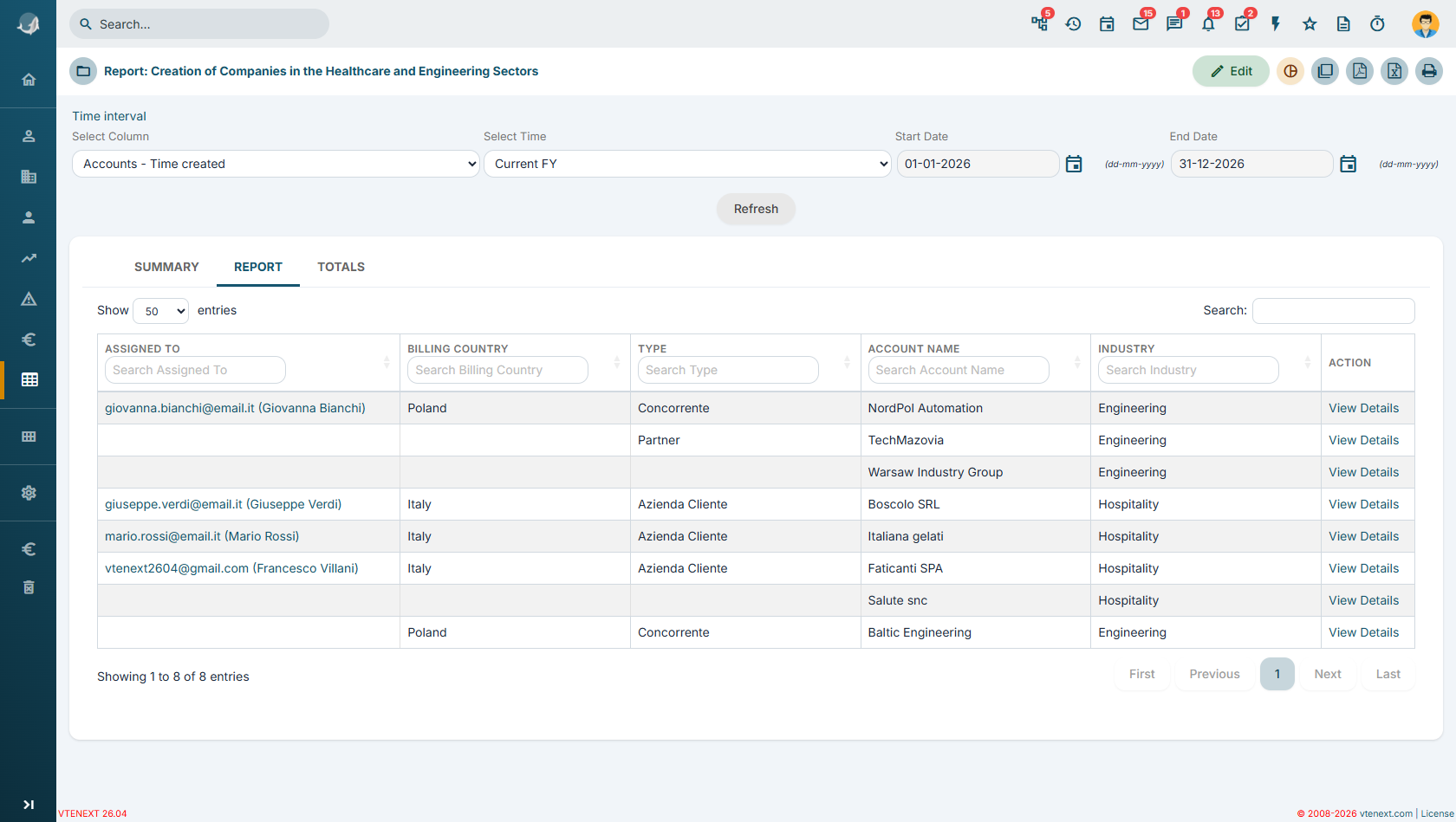
In this report, some values are intentionally not repeated. For example, in the second record, the value of the Assigned To field is not displayed because it is the same as in the previous record (giovanna.bianchi).
Data is presented in an aggregated form and grouped according to the criteria defined in the report. Starting from the first column, all companies assigned to the same user are displayed together. In this case, all companies assigned to Giovanna are shown first, followed by those assigned to other users.
Within each group, records are further aggregated according to the additional criteria defined in the report, namely:
-
Country
-
Type
Report Results (Summary Report) – Summary Tab
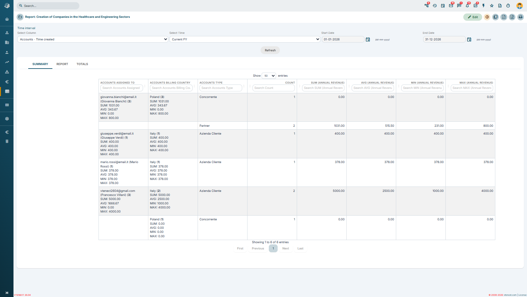
In the Summary Tab, for fields where the “Show Summary” flag has been enabled, it is possible to display a set of statistics related to the selected metric in the report (in this case, Revenue).
For each field selected in Step 6 - Select Columns, the system displays:
-
number of records;
-
sum of the selected metric;
-
average value;
-
minimum value;
-
maximum value.
In the example shown, we can see that Francesco has 3 assigned companies, which generate a total revenue of €500. The average revenue is €166, the minimum value is €0, while the company with the highest revenue generates €400.
Continuing the analysis of the summary, we can see that companies are further aggregated according to the criteria defined in the report. For example, for the Country field, we find:
-
2 Italian companies, with their respective revenue details;
-
1 Polish company, also with its corresponding revenue.
As we move deeper into the aggregation levels, the two Italian companies are classified as Customer, while the Polish company is classified as Competitor.
Note: If a Summary Report is created but no field has the “Show Summary” flag enabled in Step 6 - Select Columns, the Summary tab will not be displayed.
The system generates the summary only for fields where statistical calculations have been explicitly enabled. If no fields are configured for summary calculation, the report has no aggregated data to process and, as a result, the Summary tab is not shown.
13.2 Charts
Once you have created a report you can generate a chart from it using the Create Graph button.
![13.2 [1].png](https://usermanual.vtenext.com/uploads/images/gallery/2022-06/9E513-2-1.png)
![13.2 [2].png](https://usermanual.vtenext.com/uploads/images/gallery/2022-06/jNZ13-2-2.png)
|
Type |
Click on the type of chart you want: pie, histogram, bar … |
|
Chart Name |
Enter chart name |
|
Show Legend |
Activate to view the legend |
|
Show Labels |
Activate to display labels in the chart |
|
Show values |
Allows you to choose whether to display values (count) or percentages |
|
Folder Name |
The charts are organised in folders like documents |
|
Formula |
Allows you to choose whether to display the count, the sum, the average, the maximum or the minimum |
|
Palette |
Allows you to choose the colours of the chart, among predefined combinations |
|
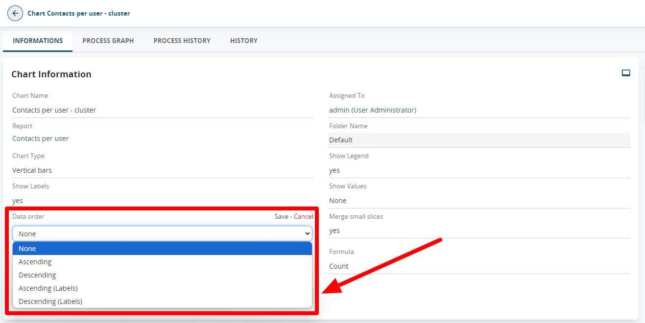
Data Order |
Allows you to define data sorting; if not set, it depends on the grouping criteria defined in the report |
Warning!
If the SHOW LABELS field is set to YES, the SHOW VALUES will not display any results.
If the SHOW LABELS field is set to NO instead, with the SHOW VALUES set to either VALUES or PERCENTAGES, it will show you the data on a single slice of the pie chart.
The graphs are available in the Charts module, organised into folders in the same way as with Reports.
The charts can also be added to the user’s Home Page through the button (see relevant chapter) or in the custom tabs of the modules.
Once the report is saved, it will be possible to edit the charts directly from the "Charts" module in vtenext. On this page, you can modify the parameters previously selected, and only here, you can determine the label sorting by using the "Data Order" option. This is particularly useful if you need to sort values alphabetically or arrange numbers in ascending/descending order.