
Branzino - User Manual
Interface Overview
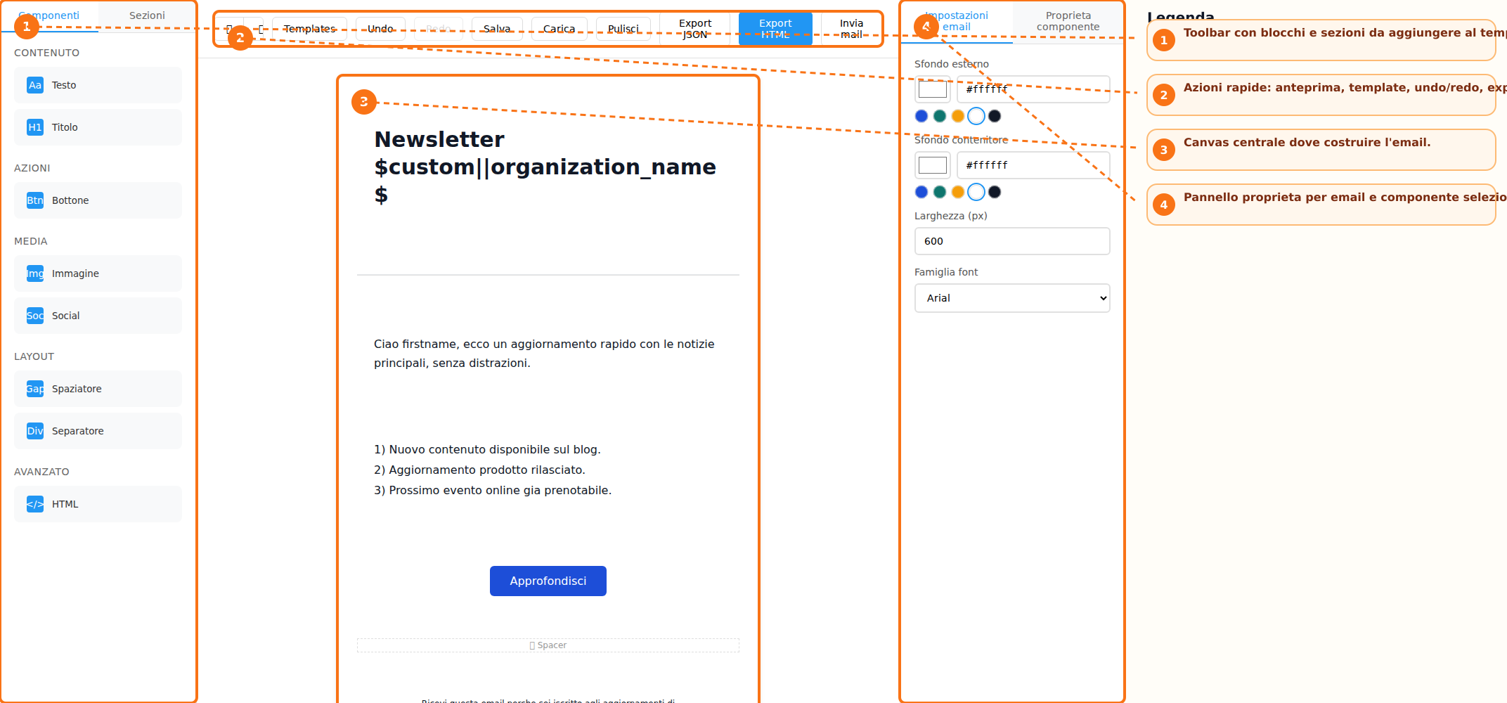
The builder interface is organized into three main areas: the sidebar toolbar, the central canvas, and the properties panel. The toolbar contains the **Components** and **Sections** tabs, from which users can select the elements to be added to the email. The central canvas represents the workspace where the newsletter content is created. Here, users can view the email structure in real time and modify its content. On the right side, the **Properties Panel** displays the email settings and the options related to the currently selected element. The interface is completed by the **Action Bar**, which provides access to template management, undo and redo functions, preview options, email export, and email sending features.
Creating a New Email
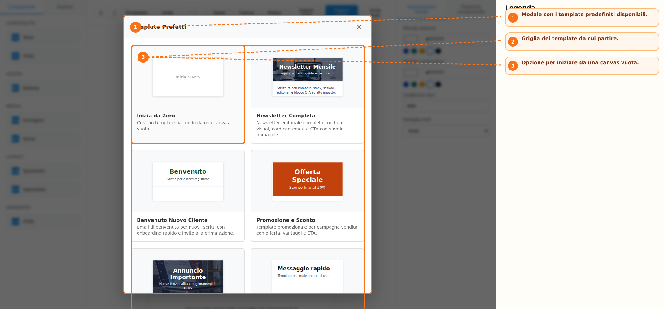
To start designing a new email, users can choose between two operating modes. The first option is to use one of the predefined templates available in the library, accessible through the **Templates** button. Templates are available for newsletters, promotions, events, and other common use cases. Alternatively, users can select the **Start from Scratch** option, which opens an empty canvas where the email content can be built freely from the ground up.
Content and Layout Management
Email composition is performed by adding blocks and sections available in the toolbar. The available content blocks include:
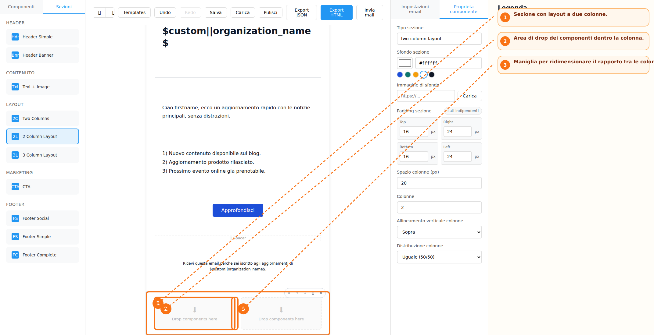
Several preconfigured sections are available to structure the email layout:
Elements can be added either by using drag-and-drop or by simply clicking the corresponding buttons. Each block also includes quick controls that allow users to:
- Move the block up or down
- Duplicate the block
- Delete the block
- Drag and reposition it within the layout
For multi-column layouts, column widths can be adjusted using the dedicated resize handle, allowing greater flexibility in the design of the email structure.
Text Editing and Visual Customization
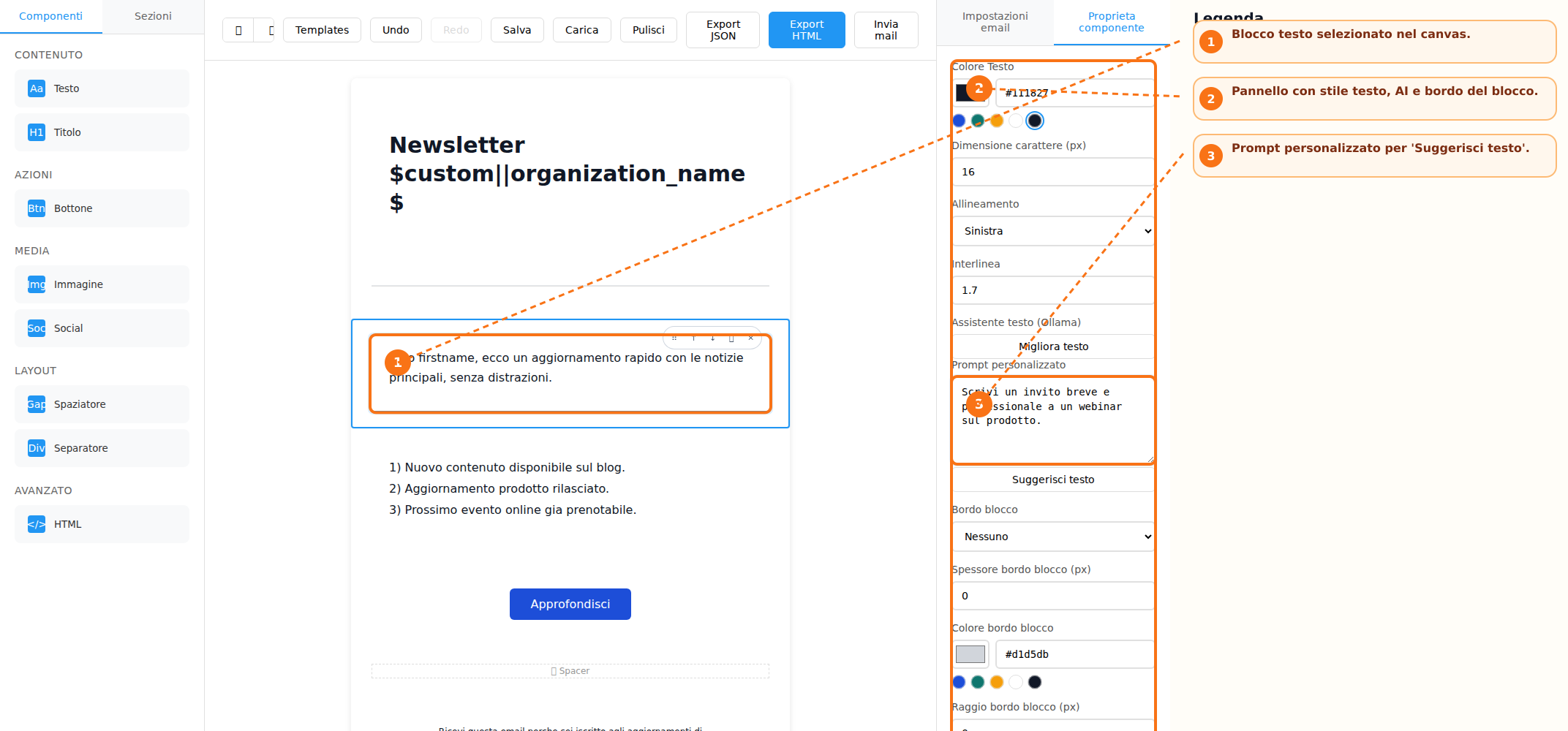
Text blocks support direct content editing within the canvas. For each text element, users can customize key typography settings, including:
-
Text color
-
Font size
-
Line height
-
Text alignment
For heading elements, users can also select the appropriate heading tag (for example, H1, H2, H3, and so on). All modifications are managed through the Properties Panel, which automatically updates the available options according to the currently selected element.
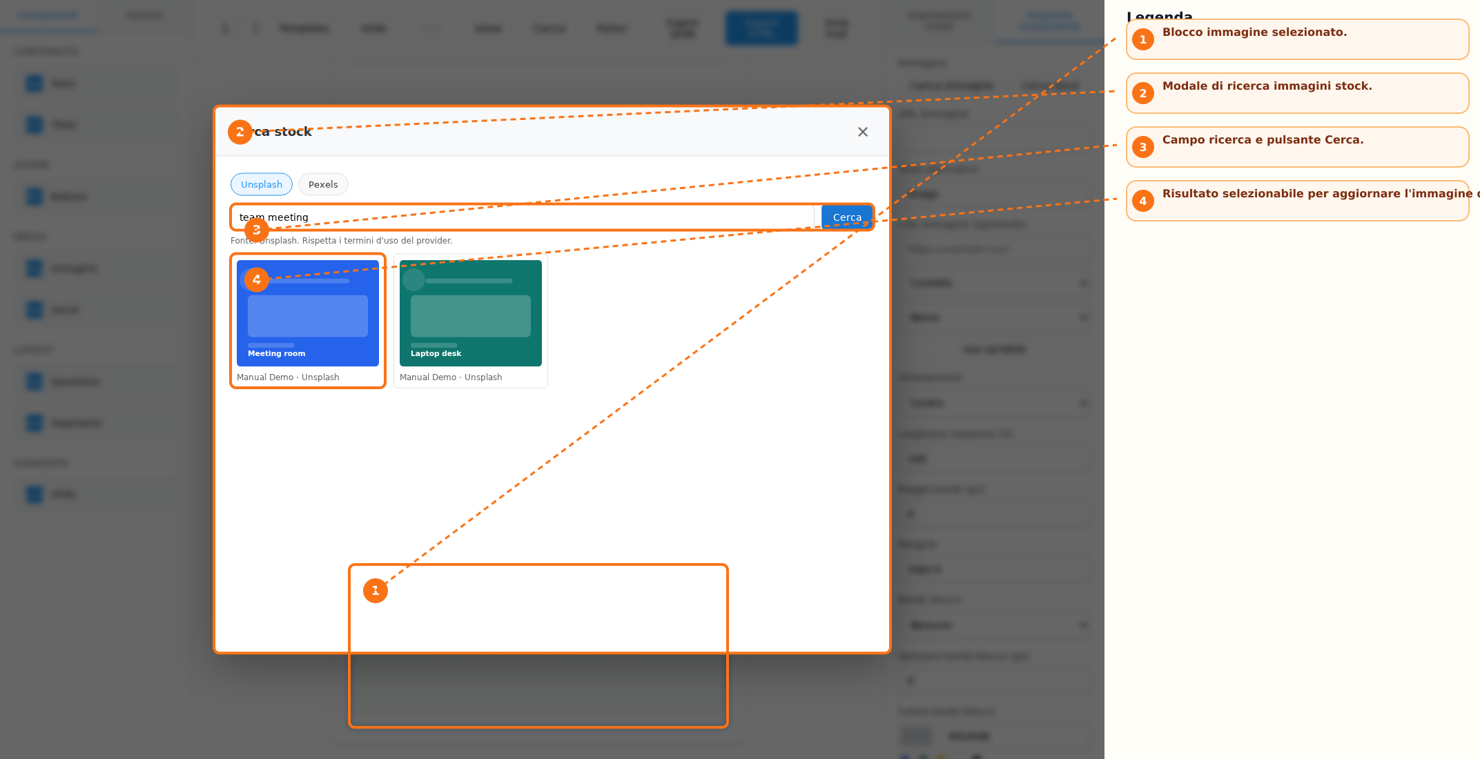
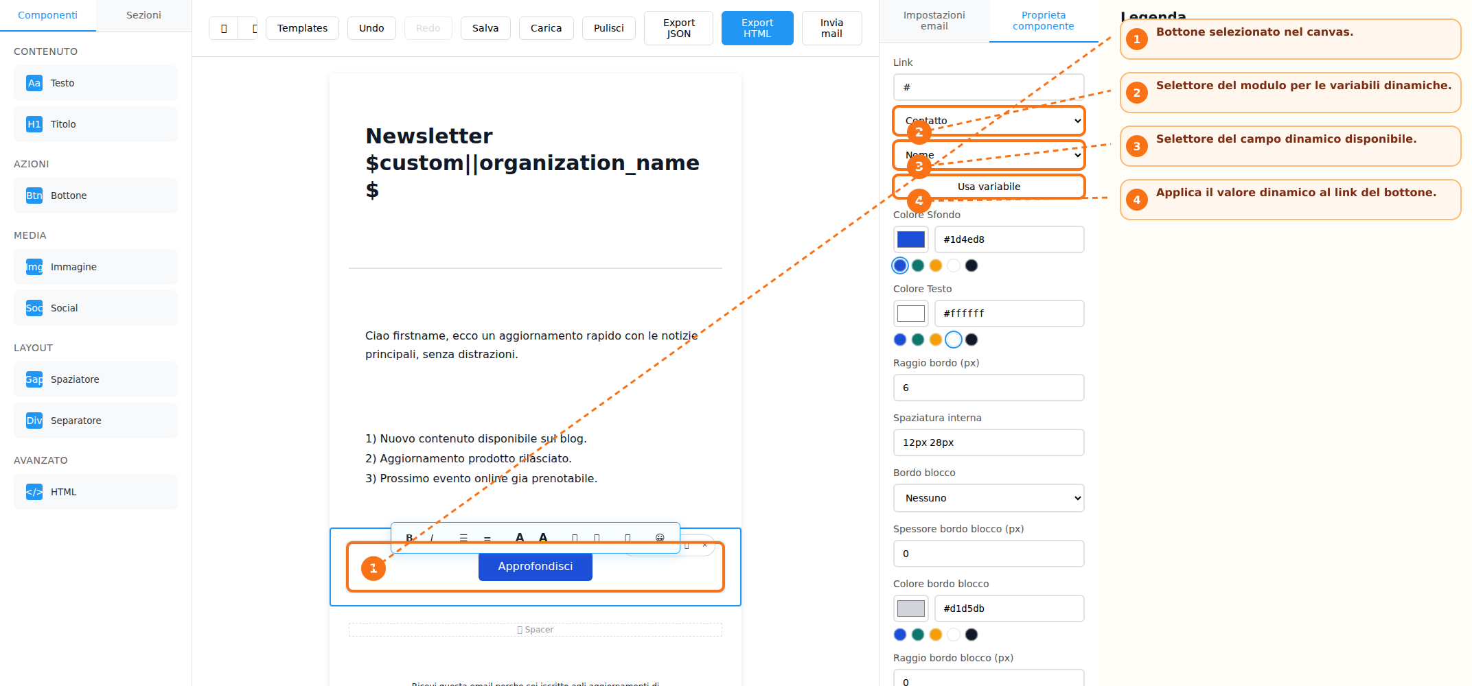
Image Management and Dynamic Content
Images can be added to the email content using the dedicated button available within the Image block. In addition to direct uploads, the system allows users to search and select images from configured stock image providers. For each image, the following settings can be configured:
-
Alternative text (Alt Text)
-
Alignment
-
Border radius
-
Margins
The builder also supports the use of dynamic fields (merge fields) for managing personalized content and links. Links associated with images and buttons can be configured by selecting a specific module and field, enabling the use of dynamic variables within email content. This functionality allows email elements to automatically display personalized information based on the recipient's data.
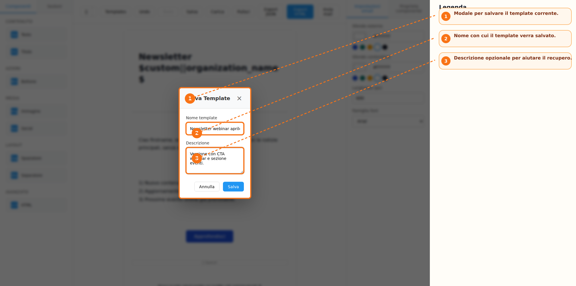
Saving and Reusing Templates
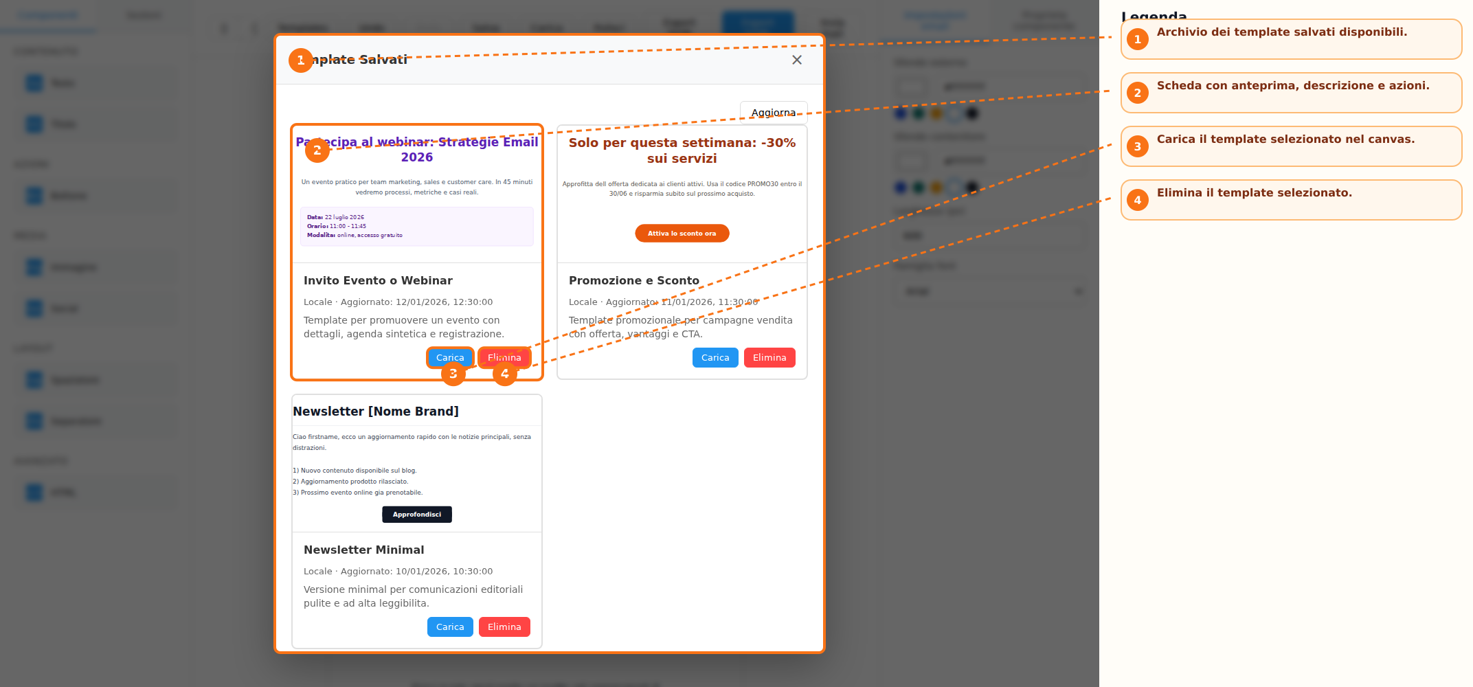
Once the work is completed, the template can be saved for future use. During the saving process, users can assign a name and a description to the template. Saved templates are stored in a dedicated list that also includes an HTML preview. From the template archive, users can:
-
Load an existing template into the canvas
-
Reuse previously created templates
-
Delete templates that are no longer needed
Export, Preview, and Sending
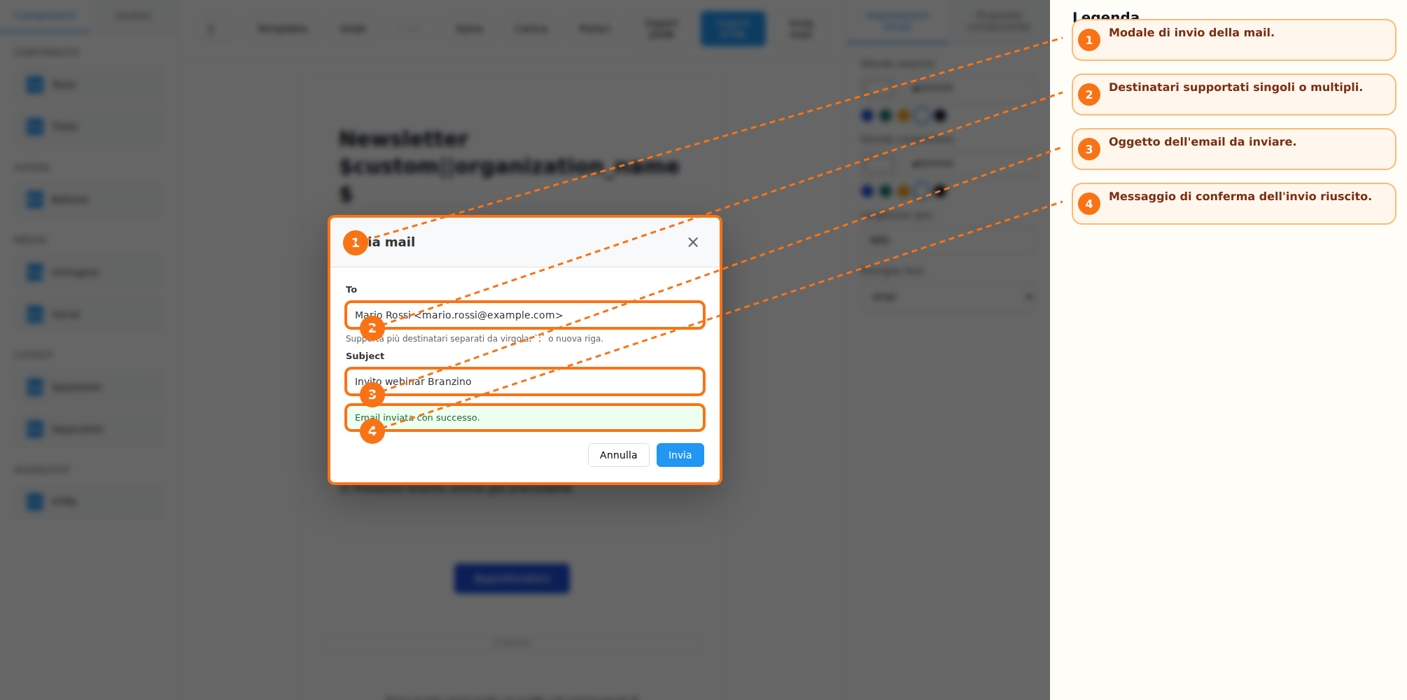
The builder provides several features for reviewing and distributing the created content. When supported by the configured integration, the result can be exported in HTML and JSON formats. The application also allows users to preview the email in both desktop and mobile modes directly from the action bar. If a dedicated email-sending endpoint is configured, the builder also enables direct sending of emails from within the interface.
Change History and Auto-Save
During email composition, the system keeps a history of performed actions. The Undo and Redo functions allow users to respectively cancel or restore changes made during the editing process. An automatic draft-saving system is also available. In case the application is restarted, the builder can prompt the user to restore the previously saved work.
Keyboard Shortcuts
To speed up the workflow, the following shortcuts are available:
-
Ctrl/Cmd + Z → Undo
-
Ctrl/Cmd + Shift + Z or Ctrl/Cmd + Y → Redo
-
Delete or Backspace → Delete the selected block (when the cursor is not inside an editable field)
-
Escape → Close any open modal windows
Recommended Workflow
To create a new email, the following process is recommended:
-
Choose whether to start from a predefined template or a blank canvas
-
Add blocks and sections from the side toolbar
-
Select elements and customize them using the properties panel
-
Use Undo and Redo during composition when needed
-
Save the template if you want to reuse it in the future
-
Review the result using desktop and mobile previews
-
Export the content as HTML or JSON, or send a test email if supported by the integration
Operational Notes
The stock image search feature is only available when at least one image provider has been configured. Functions such as Save, Load, Export HTML, Export JSON, and Send Email can be enabled or disabled depending on the host integration. The builder automatically saves a local draft and may offer to restore it when the application is reopened.