
18.3.2 Customer Portal Interface
INTERFACE VERSION 1
Once they have entered their login details, your customer can first enter a new request for assistance and then access the entities that you have related to his contact card (only enabled modules) from the menu items on the left. Support requests by default provide for an email to be sent to the contact's email address, with the summary and ID of the ticket. Any subsequent comments will always be notified by email. Once you have dealt with the contact request, you can close the ticket (if satisfied with the result).


INTERFACE VERSION 2
Based on the configurations made in Chapter 18.3 and 18.3.1, the Customer Portal can appear differently for each user who uses it. This is determined by the profile assigned to that specific user:
ATTENTION: the v2 portal is responsive.
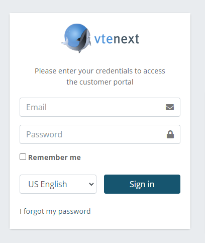
This image represents the Login page for the Customer Portal.
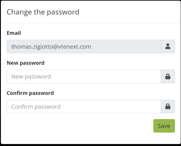
Upon the first access, the Customer Portal prompts you to change the password, so you can immediately set a different one from the system-generated default password.
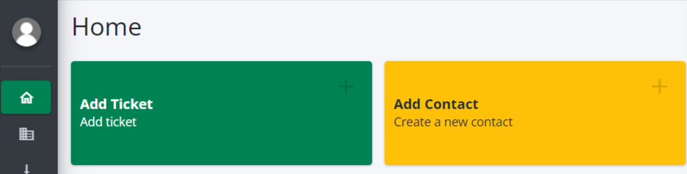
Here's how the portal interface looks once you've logged in:
- On the left, you will find all the modules that the user's profile allows them to access. For each module, the portal user can search among their records, create new records, and consult existing records;
- In the center, there are all the buttons that have been configured in the settings. These buttons facilitate a more user-friendly experience of the Portal;
- On the right, in addition to the LOGOUT button that allows quick logout from the platform, there is also a small button that activates full-screen mode;
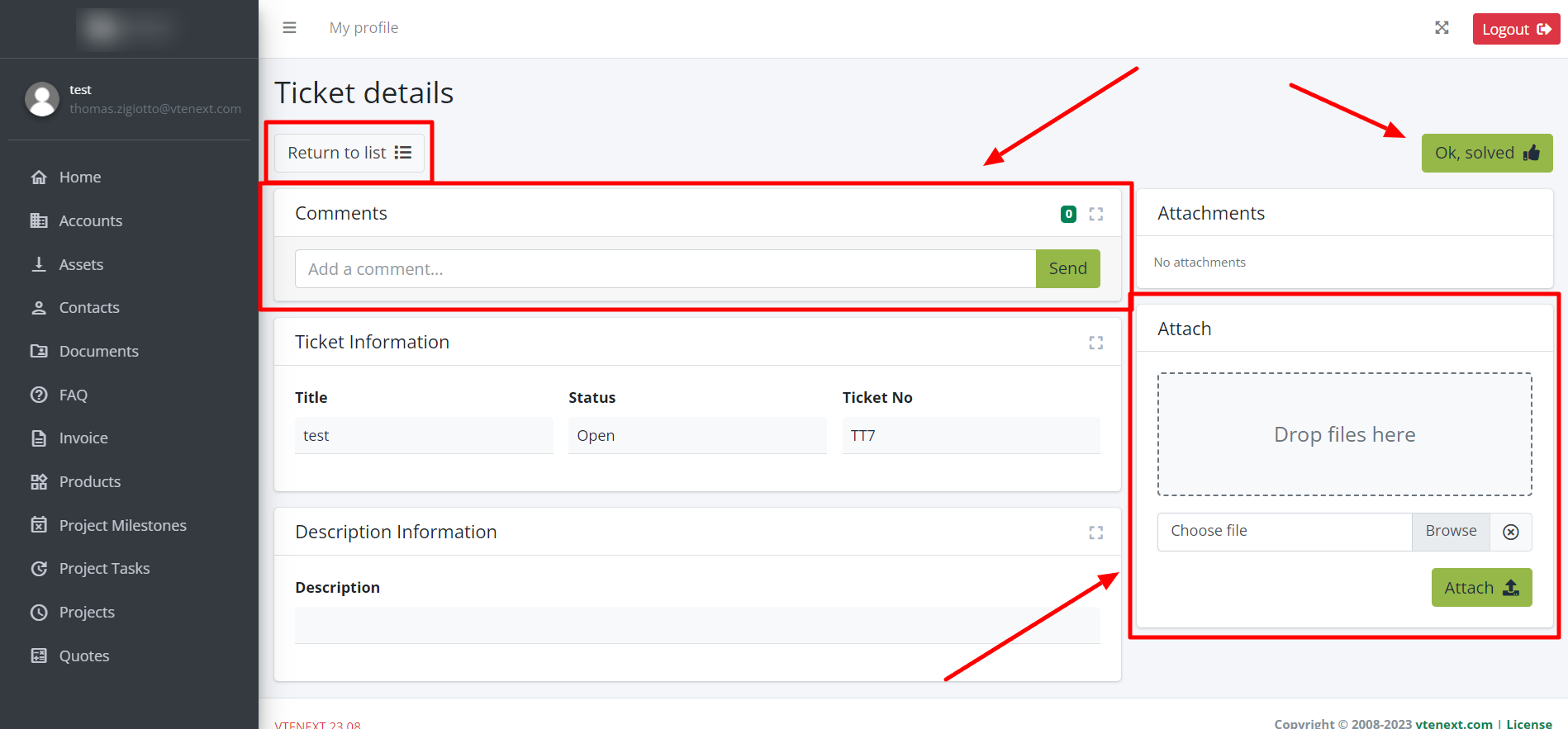
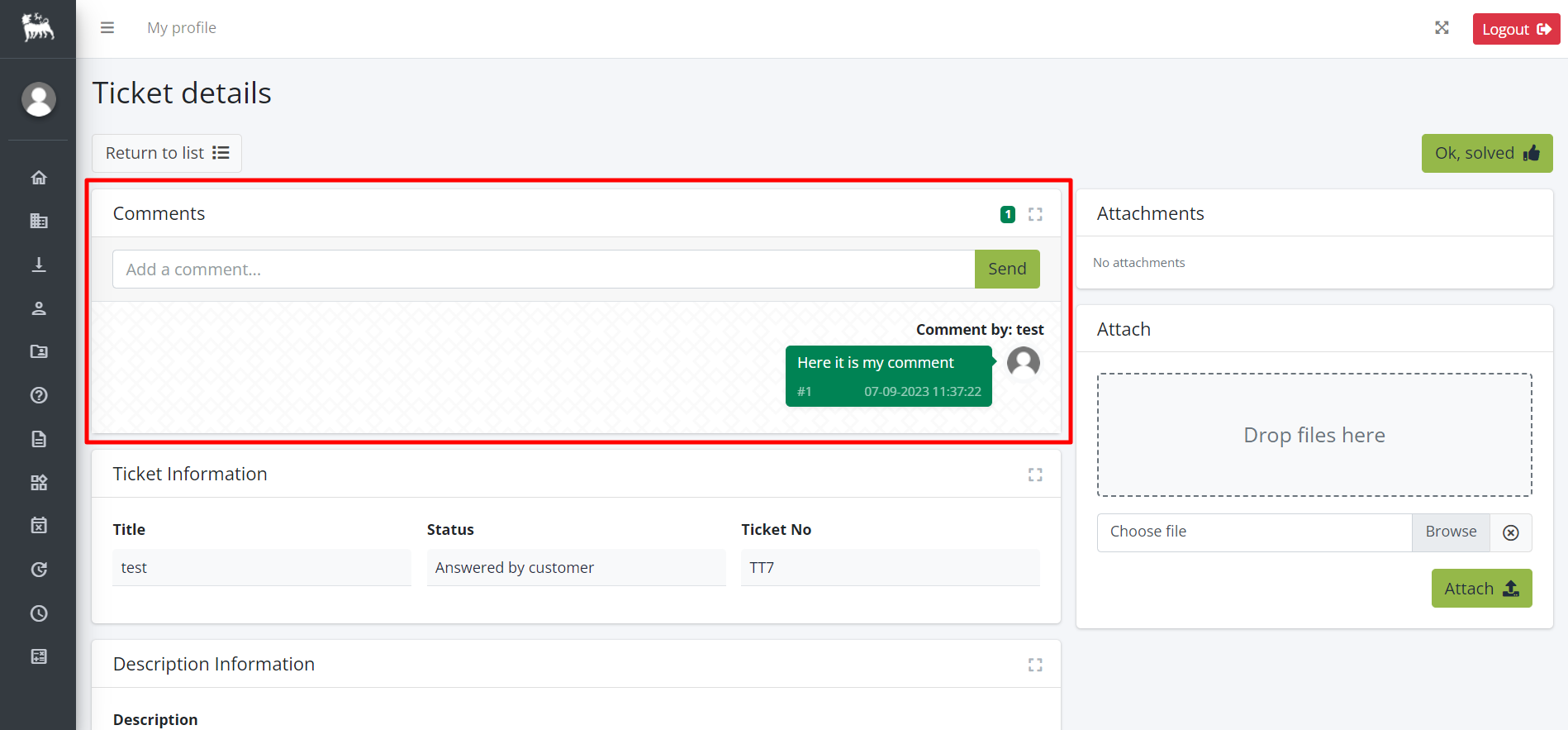
Here's the interface for viewing an existing ticket. Notice the 'RETURN TO LIST' button on the left, which allows you to go back to the list view of all the customer's reports. The comments section has been placed at the top for easy access, while the area for uploading new Documents is located on the right, with the option to drag and drop them. Using the 'OK RESOLVED' button, the portal user can autonomously close the ticket. This type of display is repeated for other modules as well, with different field types
Here's how the Comments section looks. In the center, you have the back-and-forth communication between the Portal User and Customer Support. In the top-right corner, the small blue background number (3) represents the number of Comments
In this screen, you can see the list of all the tickets in the Portal. With this view, you can search based on any of the displayed fields, matching multiple columns together, or perform a general search using the box in the top-right corner. This display pattern is repeated for other modules, with field types changing accordingly