13.2 Charts
Once you have created a report you can generate a chart from it using the Create Graph button.
|
Type |
Click on the type of chart you want: pie, histogram, bar … |
|
Chart Name |
Enter chart name |
|
Show Legend |
Activate to view the legend |
|
Show Labels |
Activate to display labels in the chart |
|
Show values |
Allows you to choose whether to display values (count) or percentages |
|
Folder Name |
The charts are organised in folders like documents |
|
Formula |
Allows you to choose whether to display the count, the sum, the average, the maximum or the minimum |
|
Palette |
Allows you to choose the colours of the chart, among predefined combinations |
|
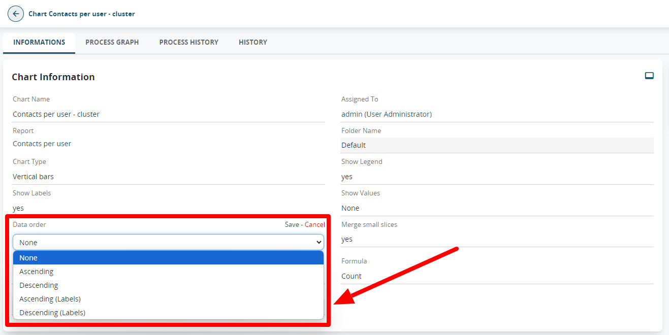
Data Order |
Allows you to define data sorting; if not set, it depends on the grouping criteria defined in the report |
Warning!
If the SHOW LABELS field is set to YES, the SHOW VALUES will not display any results.
If the SHOW LABELS field is set to NO instead, with the SHOW VALUES set to either VALUES or PERCENTAGES, it will show you the data on a single slice of the pie chart.
The graphs are available in the Charts module, organised into folders in the same way as with Reports.
The charts can also be added to the user’s Home Page through the button (see relevant chapter) or in the custom tabs of the modules.
Once the report is saved, it will be possible to edit the charts directly from the "Charts" module in vtenext. On this page, you can modify the parameters previously selected, and only here, you can determine the label sorting by using the "Data Order" option. This is particularly useful if you need to sort values alphabetically or arrange numbers in ascending/descending order.

![13.2 [1].png](https://usermanual.vtenext.com/uploads/images/gallery/2022-06/scaled-1680-/9E513-2-1.png)
![13.2 [2].png](https://usermanual.vtenext.com/uploads/images/gallery/2022-06/scaled-1680-/jNZ13-2-2.png)
